Print Quality Guide · ExpressPrint Singapore
From screen to paper, offset to digital, gloss to matte — everything that changes your final print colour, explained clearly before you order.
Updated May 2026 · 10 min read · Applies to all offset, digital, large format & sublimation products
In this guide
- Why your screen colour never matches your print
- Offset, digital, large format — why the same artwork prints differently on each machine
- Repeat orders — why your reprint looks slightly different
- Paper & substrate — how your material changes every colour
- Finishing — how lamination, UV and foil shift colour appearance
- Our acceptance tolerances and what qualifies for a reprint
You put care into your artwork. The colours look perfect on screen, the file is CMYK, the PDF looks right. Then the printed piece arrives and the blue is slightly different, or the repeat order doesn’t quite match the first one. Nothing went wrong. This is normal — and it is explainable. This guide walks through every factor that changes how colour looks in print, mapped to the specific machines and products we use at ExpressPrint. Understanding these factors is the fastest way to avoid surprises and set accurate expectations before any job goes to press.
1. Why Your Screen Colour Never Matches Your Print
This is the most fundamental source of colour confusion in printing, and it has nothing to do with machine quality. Your screen and your printer use two entirely different systems to create colour — and they are physically incapable of producing identical results.
Light vs. Ink — an additive and subtractive problem
Your monitor creates colour by emitting light. It combines Red, Green and Blue light (RGB) in varying intensities. When all three are at full intensity, you see white. When all are off, you see black. This is called additive colour mixing. Print creates colour by absorbing light. Ink on paper absorbs certain wavelengths and reflects the remainder back to your eye. The four process inks — Cyan, Magenta, Yellow and Black (CMYK) — are layered in tiny halftone dots to simulate colour. This is called subtractive colour mixing. The more ink, the darker the result. Because one system uses light and the other uses ink on paper, they operate in fundamentally different colour spaces with different ranges of achievable colours.
Screen (RGB)
RGB
16,000,000+ colours
Emits light. Vivid and luminous. What you see on screen.
→
Print (CMYK)
CMYK
~16,000 colours
Absorbs light using ink. Narrower range. What is physically printable.
Colours that exist on screen but cannot be printed:
|
Out of range |
CMYK printable range |
Out of range |
The dashed box represents the full RGB colour range. The inner coloured block is what CMYK ink can reproduce. Neons, electric blues and ultra-vivid greens fall in the outer zone — they cannot be printed in CMYK.
Your screen can display over 16 million shades. CMYK ink on paper can reproduce roughly 16,000. Bright neon colours, electric blues, vivid greens and fluorescent tones that glow on a monitor simply cannot be reproduced in physical ink. This is not a print error — it is a physical limitation of ink on paper that no printer in the world can overcome.
Your on-screen artwork is still RGB
Even when you view a CMYK file on your monitor, your screen is translating ink values back into RGB light — showing you its best approximation. What you see on screen is always an interpretation, not a guarantee of the final printed result. The only way to know exactly how a colour will print is to understand the process and material it is printed on.
Practical rule: Always prepare your artwork in CMYK colour mode before submitting. If you design in RGB and we convert on your behalf, some colours will shift. Working in CMYK from the start gives you full control over how the final print looks. See our PDF preset guide →
2. Offset, Digital, Large Format — Why the Same Artwork Prints Differently on Each Machine
Even with a correctly prepared CMYK file, printing the same artwork on different machines will produce visibly different colours. This is one of the most common surprises customers experience — and it is completely expected. Each printing process uses different ink chemistry, different application methods, and different substrates. The colour output is never identical across methods. Here is how every machine we run at ExpressPrint works, and what it means for your colour:
Offset Litho
Oil-Based Ink via Printing Plates
Litho offset press
Deep, dense, rich blue
Four aluminium plates transfer oil-based ink via a rubber blanket onto paper. Produces the highest colour density and sharpest dot structure of any print method.
Digital
High Chroma Toner, Direct-to-Paper
Konica Minolta high chroma production printer
Cooler, slightly more saturated
No plates. High chroma toner applied electrostatically and fused with heat. Vivid, punchy colour — often more saturated than offset for short runs — but with a different character from oil-based ink.
Large Format
Solvent / UV Inkjet on Wide Substrates
Mimaki / Epson wide-format inkjet (production-dependent)
Brighter, more open, wider gamut
Inkjet nozzles spray solvent or UV-curable ink onto vinyl, canvas or synthetic substrates. Completely different ink chemistry — colours are not comparable to offset or digital output on art card.
Sublimation
Dye Sublimation — Into the Surface
Epson 1440 dpi sublimation printer
Solid dye converts to gas under heat and pressure, bonding directly into the coated surface or fabric. Produces vibrant, full-bleed colour — but output is heavily influenced by the base material. A ceramic mug and a fabric mouse pad will render the same artwork with different saturation and tone, even from the same printer.
UV-DTF
UV-Curable Ink, Precision Flatbed Press
High-resolution UV flatbed press
UV-curable ink is cured instantly by ultraviolet light, producing a durable, high-opacity result on film that transfers cleanly to the final surface. Colour is bright and opaque, including on dark backgrounds — a characteristic that offset and digital toner cannot replicate.
A practical example: If you send the same blue (C:100 M:60 Y:0 K:10) to all three main processes, you will receive three visibly different blues — all technically correct for their respective method. This is not a quality problem. It is the nature of different printing technologies using different inks on different materials.
Important: Cross-method colour matching — expecting your offset business card to match your large format banner — is not achievable by any printer. If brand colour consistency across print methods is critical, discuss Pantone (PMS) spot colour specification with our team before ordering.
Which products use which machine at ExpressPrint
Offset Litho — oil-based ink, plates, highest colour density
→ Flyers & Brochures→ Business Card (Standard)→ Business Card (Folded)→ Business Card (Die-Cut)→ Booklet (Perfect Bind)→ Booklet (Saddle Stitch)→ Booklet (Hard Cover)
Konica Minolta High Chroma — digital toner, no plates, fast turnaround
→ Loose Sheet (Digital)→ Business Card (Express)→ Booklet (Short Run)→ Certificate→ Document→ Label Sticker (Kiss Cut)→ Label Sticker (Multiple Dieline)
Mimaki / Epson Wide-Format Inkjet — solvent/UV ink, display substrates
→ Rollup Stand→ Pop-Up Backdrop→ Poster→ Human Standee→ Flag→ X-Stand→ H-Stand→ POP Display→ Placard
High-Resolution UV Flatbed Press — UV-curable ink, vibrant on non-paper surfaces
Epson 1440 dpi Sublimation — dye transfers into coated surface or fabric
→ Mug (11oz)→ Mouse Pad→ Puzzle→ Table Mat
3. Repeat Orders — Why Your Reprint Looks Slightly Different
This is the most common question we receive: “I used the same artwork — why doesn’t the reprint match my original?” Colour consistency between separate print runs cannot be guaranteed to be identical, even with exactly the same file on the same machine. There are four honest reasons why.
1 · Ink batch variation
Commercial printing inks are manufactured in large batches. Different batches of the same ink colour from the same supplier carry minor pigment variations. These differences are imperceptible in the can but can be visible on press at full production density — particularly in deep saturated colours like navy, forest green and burgundy.
2 · Paper batch variation
Paper is also manufactured in mill runs. Even the same grade and weight from the same supplier can vary between batches in brightness, whiteness, surface smoothness and caliper. A slightly warmer or cooler base sheet shifts every colour printed on top of it. We source paper from reputable suppliers but cannot guarantee every repeat order comes from the identical mill batch as your original.
3 · Press conditions on the day
Temperature, humidity, ink viscosity, roller pressure and machine calibration all affect colour output. A job printed during a hot and humid Singapore afternoon may read slightly differently from the same job run on a cool morning — even on the same press, on the same day. These are real-world production variables that every commercial printer operates within.
4 · Gang printing (offset jobs)
Most commercial offset printing runs multiple different jobs on the same large sheet simultaneously — this is called gang or aggregate printing, and it is how we keep prices competitive. Ink density is calibrated for the sheet as a whole, not for each individual job. This means your flyer or business card shares ink balance with other jobs on that sheet. Minor variation between separate gang runs is inherent to this process.
Our standard: Colour variation across separate print runs is acceptable within 10% of the intended colour, measured against our in-house CMYK Colour Reference Book. For orders where brand colour consistency across repeat runs is critical — corporate stationery, branded collateral, packaging — speak to us about Pantone (PMS) spot colour before ordering.
Products most affected by repeat-order colour variation
→ Business Card (Standard)→ Flyers & Brochures→ Booklet (Perfect Bind)→ Booklet (Saddle Stitch)
4. Paper & Substrate — How Your Material Changes Every Colour
Paper is not a neutral, passive surface. It is an active variable that directly changes how colour is perceived. Two identical CMYK files printed on two different papers will look different — not because something went wrong, but because the physics of light reflection and ink absorption differ on every substrate.
Paper whiteness and base tone
Paper “white” is not a single shade. Commercial paper ranges from cool blue-white to warm ivory-white, and different batches from the same mill vary slightly. Because all printed colour sits on top of this base tone, the paper acts as a colour filter for everything above it.
Cool Blue-White
Blue reads true and neutral. Reds appear slightly cool. Crisp, contemporary feel.
Neutral White
Standard commercial stock. Closest to balanced, predictable colour output.
Warm Ivory-White
Blue shifts toward green-blue. Reds lean orange. Warm, natural, classic feel.
A low-brightness recycled sheet — yellowish or greyish in base tone — will make every colour appear darker and less saturated. Printing blue on a yellowish sheet pushes it toward green. Printing red on the same sheet makes it look more orange. This is physics, not a printing error.
Coated vs. uncoated — how ink sits on the surface
This is the single biggest factor in how vivid your colours appear. Coated and uncoated papers interact with ink in fundamentally different ways.
Real example: The same rich navy blue on a 350gsm gloss art card business card will look noticeably lighter and softer if reprinted on an uncoated woodfree stock. Neither is wrong. They are different materials behaving exactly as expected.
Substrate considerations for non-paper products
For large format display products — rollup stands, backdrops, flags, posters — the substrate is vinyl, synthetic paper or fabric. These materials have very different surface reflectance and ink absorption characteristics. Colours produced by wide-format inkjet on vinyl are not directly comparable to offset or digital output on art card and should not be expected to match. For sublimation products — mugs, mouse pads, puzzles, table mats — the dye bonds directly into the coating of the surface. The base colour and finish of the substrate (pure white ceramic vs. polymer-coated fabric) has a direct effect on how vibrant and true-to-file the final colour appears.
Products where paper or substrate choice most visibly affects colour
→ Business Card (Standard)→ Business Card (Express)→ Flyers & Brochures→ Loose Sheet (Digital)→ Mug (11oz)→ Mouse Pad
5. Finishing — How Lamination, UV and Foil Shift Colour Appearance
Finishing is applied after printing — but it significantly changes how the final colour is perceived. Every finishing option changes the way light interacts with the surface, which directly changes how bright, deep or muted the colours appear. A finished piece will always look different from viewing your artwork on screen. This is expected and intentional.
✦ GLOSS LAMINATION
Colour effect: deeper · more saturated · higher contrast
Gloss Lamination
A clear gloss film bonded over the printed surface reflects more light back to the eye. Colours appear richer and more vivid. Blues deepen, blacks intensify, images pop.
MATTE LAMINATION
Colour effect: softer · less saturated · more muted
Matte Lamination
A non-reflective film diffuses light. Colours appear softer and more muted than gloss or unlaminated print. This restrained quality is the intended effect — not a colour deficiency.
SOFT TOUCH
Colour effect: noticeably softer · velvety · muted tones
Soft Touch Lamination
A velvety matte film that mutes colour saturation further than standard matte. Colours read noticeably softer than on screen. The premium tactile quality — not colour — is the primary intent.
✦ GLOSS UV VARNISH
Colour effect: intensified · high-gloss · rich contrast
Gloss UV Varnish
UV-cured liquid coating applied over the print. Enriches colour saturation and adds a high-gloss sheen. Colours appear more vivid and deeper than adjacent uncoated areas.
SPOT UV vs matte base
Colour effect: contrast between gloss zones and matte base
Spot UV
Localised UV gloss over a matte base. UV zones appear deeper in colour relative to surrounding matte areas. The visual drama comes from the contrast between the two surfaces.
✦ FOIL / EMBOSS / HOTSTAMP
Colour effect: metallic — cannot match any CMYK value
Foil Stamping, Embossing, Hotstamp
Metallic foil colours are reflective and cannot correspond to any CMYK value. Do not attempt to match foil to on-screen colours. Subject to ±0.5mm positional tolerance.
Important: Because finishing changes how colours appear, your on-screen artwork is not a valid basis for a colour dispute on a finished piece. If your project has strict colour or finishing requirements, contact our team before ordering so we can advise on the right material and finish for your needs.
Products with finishing options that affect colour appearance
→ Business Card (Standard)→ Business Card (Folded)→ Business Card (Die-Cut)→ Flyers & Brochures→ Booklet (Perfect Bind)→ Booklet (Saddle Stitch)
6. Our Acceptance Tolerances — What Qualifies for a Reprint
The following tolerances define the quality standard we hold every job to. Any claim for a reprint will be assessed against our CMYK Colour Reference Book and physical inspection standards. These tolerances apply to single loose sheet products only and are not applicable to large format, sublimation, or collated products such as booklets.
| Defect Type | Acceptable | Qualifies for Reprint |
|---|---|---|
| Colour Discrepancy | ≤10% variance from intended colour | >10% difference per CMYK Reference Book |
| Colour Variance (same batch) | ≤10% variance between pieces in same run | >10% variance across same batch |
| Spot UV / Hotstamp / Diecut / Emboss | ≤0.5mm positional offset | >0.5mm misregistration |
| Dirty Spots | 1 spot <0.5mm diameter within any 5cm² | 2+ spots in 5cm², or any spot >0.5mm |
| Lamination Bubbles | Any quantity of bubbles <0.5mm | Any bubble >1mm in diameter |
| Trimming — Offset | <1mm from trim edge | >1mm trim offset |
| Trimming — Digital | <2mm from trim edge | >2mm trim offset |
*All artwork must include a minimum 3mm bleed beyond the intended trim edge. Without bleed, any shift within tolerance can result in a white edge. See our PDF preset and bleed guide →
Colour Discrepancy
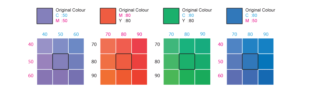
Colour is measured against our in-house CMYK Colour Reference Book. Up to 10% variance is within acceptable tolerance.
Spot UV Registration — includes Hotstamp, Diecut, Emboss
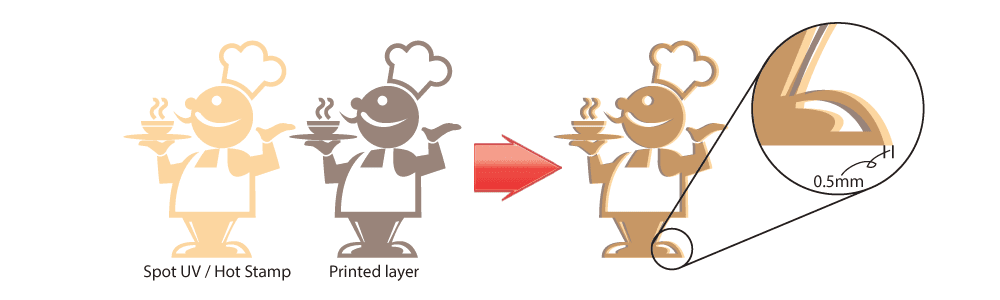
Finishing effect positioning is acceptable within ±0.5mm.
Dirty Spots
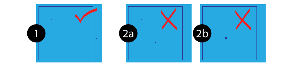
One spot under 0.5mm diameter per 5cm² is acceptable. Two or more spots, or any spot exceeding 0.5mm, qualifies for reprint.
Bubbling from Lamination

Bubbles under 0.5mm are acceptable regardless of quantity. Any bubble exceeding 1mm qualifies for reprint.
Colour Variance Within a Batch

Up to 10% colour variance between individual pieces in the same production run is within acceptable tolerance.
Have a question about your order?
Not sure what to expect from your specific product or material?
Our team is available during office hours via live chat, or by email after hours at sa***@**************om.sg. We can advise on the right paper, finish and colour mode for your project before you order.
→ Offset Flyers & Brochures→ Business Cards→ Digital Loose Sheet→ Rollup Stand→ Sublimation Mug→ PDF & Bleed GuidePolicy last reviewed May 2026. This guide applies to commercial print products produced at ExpressPrint Singapore. For Large Format, Sublimation and collated products, separate quality guidelines apply — contact our team for details.
Browse related products by category:
Browse Business Cards → Browse Booklets → Browse Display Systems → Browse Large Format → Browse Marketing Materials → Browse Label Stickers → Browse Corporate Gifts → Browse Digital (Short Run) →


