TEXT
- Curve / Create Outline / Path all the fonts before convert PDF file to avoid missing font issue.
Adobe Photoshop : Set resolution to or above 300 dpi and Rasterize Type before you save as PDF file format. We advise against setting text using Photoshop as the text will not be as sharp as vector files. - Minimum font size : 5 pts (not applicable for Pre-Inked Stamp, Hot-Stamping – refer to: Pre-Inked Stamp Artwork Specification and Hot-Stamping Artwork Specification) During printing process, minute misalignment can cause the 4 separate CMYK inks to overlap imperfectly in small text and make them look blurry. When you are working on small text, AVOID :
a. Use font type too thin
b. White text on a coloured or black background
 c. Light coloured text on a white background
 d. Reverse printing (White text on coloured background made up of a combination of 2 or more CMYK Colour Value).
– All wording that consist font size ≤ 5pts and without BOLD, must add outline to reduce the wording blurry problem. Attention : Expressprint shall not bear the consequences on the wording blurry due to small font size.
e. When you working on White background with Black text and line, you are advise to use K100 only.

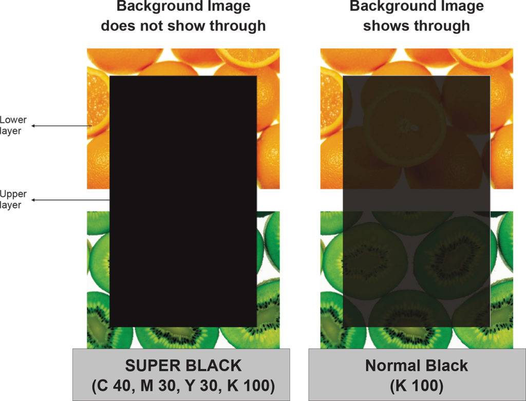
Adding a Solid Black (SUPER BLACK) area in your artwork
When a large solid black (100%K) area is required on a 4 color process job, we recommend to build the black in SUPER BLACK which has a mix of C 40, M 30, Y 30, K 100 . It will make the black denser onto an image if you want your background image not to show through.
COLOUR
- Use ONLY CMYK colour mode when in your artwork. The use of other colour mode such as RGB and Pantone will cause an inaccurate output of colours.
- Always refer to our CMYK COLOUR REFERENCE KIT while working with colours. Do not depend entirely on your monitor colour display, as printed colour of end product may differ from what appears on screen.
- AVOID setting colour tints (toning) lower than 10% Lighter shades usually print much lighter than they appear on screen and you may dissapointed with the outcome.

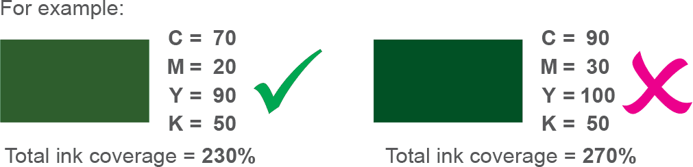
- DO NOT set black colour to (C=100 M=100 Y=100 K=100) Too much ink coverage may result in sheets sticking together and caused text or image to look blurred. To get the most from black, use the colour combinations stated below*:

*However, avoid using SUPER BLACK on small text as due to ink spread. - For Litho Offset and Digital offset, maximum total ink coverage must not more than 240%. Too much ink coverage may dirty mark printing (sheet sticking together and caused text or image to look blurred).
- In order to make your tint/toning effect more obvious, make sure the value between colours are at least 10% of different.

For black colour similar colour criteria

LINE
- DO NOT set line weight less than 0.25pts. (Not applicable for Pre-Inked Stamp, Spot UV & Hot-Stamping – refer to Pre-Inked Stamp, Spot UV & Hot-Stamping section for details)

IMAGES
- Ensure all the images are in CMYK colour mode.
- Ensure resolution of all your images are set to or above 300 dpi. Scanned Line Art/Black & white images resolution are set to or above 1200dpi.

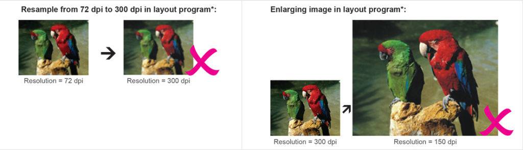
- DO NOT manipulate your images using a layout program*. You are advised to manipulate your images using Adobe Photoshop. Resolution and size (dimension) are inversely proportional to each other, which means when you are enlarging the image in layout program, you are in fact lowering the resolution.